
THE YOUNG FOLKS
Anna Middlehurst, Namita Khade, Lily Hughes
& Natasha Maher.
What Have You Learnt From Your Audience Feedback?


After our first draft for our music video Riptide we posted a link onto social media (Facebook) asking for audience feedback. We listened to their comments and added these imorovements then reposted our second draft again asking our target audience for their feed back. Here are some of their comments.
Audience Feedback For Our First Draft Music Video
Audience Feedback For Our Second Draft Music Video
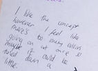
We asked our target audience to give their opinion, comments and feed back on our first draft for our music video. This was extremely helpful as we took every comment into account in order to improve our first draft. Here is what they said:
Bita Jedo
owen Seabrook
Matilda Beattie
Anomomous Comments (Suggestion Bowl)
As a Group we understood that some people may not be truthful about their suggestions for our music video due to not wanting to "offend" us. Due to this we created a "Suggestion Bowl" asking people to whatch our first draft and put one coment in the suggestion bow informing them to be completely honest as they will remain anomomousl. In addition to this we gathered many more opinions helping us to imrove our first draft even more.
What We Have Learnt From Our Audience Feedback
After listening to our audience's feedback and adjusting and adding improvements. As a group we asked different people for there opinion on our second draft. Here were their comments:
Carrie Walker
What We Learnt From Our Audience Feedback: We were overwhelmed by all the positive comments
What We Have Learnt From OUR Audience Feedback 2nd Draft.
From this wide range of feedback, we had learnt from our audience that some of the characters involved in our music video were unexplained. Also that the some of the sequences were repeated and to make it more obvious that the sing is on a "TV". We were complimented on our "light leeks" and the horse sequences that we were orginally considering to edit out. We were told there should be more of a build up opening to intrige our audience and to show more shots from the beach. In addition to all these comments we listened to our audience and created a second draft.
From our audience feedback we were complimented on our chosen settings and the opening sequence of the music video with everyone saying there have been "Big Improvements". However we were told there should be a "link" between the main girl character and the singer as it is unexplained. We came to the clusion to make them lesbians and the audience only discovering this at the end. However giving that we were so close to the deadline we were unfortunately unable to add this to our music video. In addition to this our music video allows the audience decide for themselves what the connection is between the characters or even if there is one leaving our music video an unexplained mystery.
Digipak 1 First Draft Audience Feedback
When it came to the digipak, we designed three indivualy different front covers each. We then asked our target audience which one they prefered and why. Here are the results:


Coming to the conclusion that people prefered the middle front cover we created an intire digipak following those certain themes. We made our digipak bright and vibrant have an abstarct theme to match the impages on the front cover. Here was the result:
What we Have Learnt From our Audience Feedback


Here Was Our Audience Feedback For Our Degipak
Callum Richards
Mollie Winnard
Mia Collins
AnomomOus Comments
We asked our target audience for their HONEST opinion for our first draft digipak. Here are their comments .
To gather a wide sit of anomomous comments which allowed people to be completely honest we place a printed image of our digipak onto A3 paper asking people to write their comments and opinions. Here is what was written:
What We Learnt From Our Audience Feedback
Gathering all the data from our audience feedback as a group we concluded that the digipak did not match the 'natural' theme of our music video. It was suggested that we create a more natural look reminding the audience of the seaside and the natural beauty of it instead of vibrant colours and a POP ART effect throughout as it takes away the attention from the front cover. We took all our audiences comments into consideration and recreated the digipak to satify what our target audience wanted to see. Here is the result:
Annomomous Audience Feedback For Our Degipak 2nd Draft
We asked our target audience again for their annomomous and Honest opinion for our 2nd draft digipak and if they had any suggestions for improvements. We were really please with their comments. Here is what was said:
What we Have Learnt From Our Audience Feedback
As you can see we were extremely pleased with our audience feed back. However it was suggested that we create a Logo for our music company 'The Young Folks' for recognition. In addition to this we created three possible Logos and left the audience to decided which one they prefered and why. Here are the free Logos.
Audience Feedback TO Our Advertisment Poster
LOGO 1
LOGO 2
LOGO 3
PIE CHART Table
We concluded that our advertisment poster had to be similar to our digipak so that it was recognisable to our target audience. Therefor the main image on the front cover of the digipak was the main image for our poster. We discovered that the backgroup to our poster was subjective as we couldn't decided weather it looked more attractive in black white or with a sunset in the background. In addition to this we asked our target audience what they prefered and this is what
some said:


White
Sunset
45%
55%
What We had Learnt From Our Audience Feeback:
Hands
LOST GIRL
ELi Blackmore


Dom Bibby
we recieved from our our audience feedback. We were suggested to "slow down the start and the pan across on riptide in the sand" and intruduced this in our second draft. Once our second draft was complete, we were told that there were"Major Improvements since the 1st draft" and that it looked "so professional". Taking into account the comments and suggestions from our first draft the improvements we made had certainly paid off from our audience feedback.
Complete DigiPak First DRaft
second Draft Digipak
66%
33%


22%
36%
42%

Results


From these results it was clear that most of the audience prefered 'LOGO 1' in addition to this we put it into our digipak. As well as the oppropriate text onto the digipaks spine to complete all the codes and conventions required.
From our audience feedack we had learnt that the audience prefered "sunset" over white. Off screen comments from our audience told us this was due to "it fitting in with the overall theme of the music video and digipak" and also looking more "majestic". Although some said 'white' their reasons for this were "it looked like modern art". From these results we once again listened to our audience feed back and chose 'Sunset' as our background.
The last change we had to make to our degipak is that it had to be an "album" not a "single" there-for we had to change the back cover. In addittion to this we added more songs such as "Wild Winds" and "Not Now". Although the mojority of the audience told us they prefered the orignal back cover, rules are rules.


© 2023 by The Young Folks.. Proudly created with Wix.com